One of the things I love about being a writer is that inspiration is everywhere. Even in beer. Especially in beer.
Although I’ve been known to write more than a few words directly inspired by beer, today I want to talk about the writing that is on the beer, the text that brewers, especially craft brewers, use to represent their beers to possible and actual consumers. Why write about that here? Because I think this text has some similarities to web writing:
- People don’t sit down and read it–they scan, skim, and select bits of it to be read in an iterative process, if it’s read at all
- It works in close partnership with images
- It’s broken into several pieces like a website
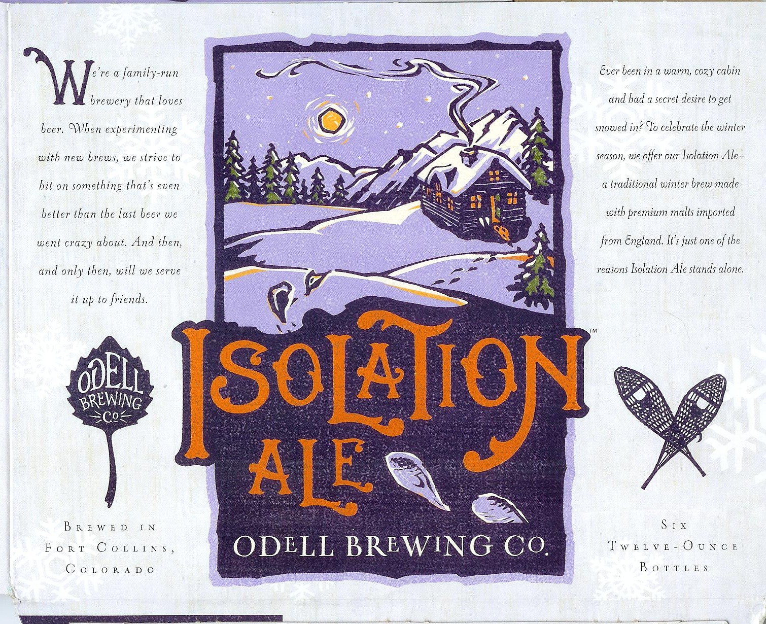
In fact, if we look at the beer carrier, we can think of it like a mini website, and it has several identifiable pages. The side of the carrier is like your home page, with banner image, and some basic text introducing the brewery in a sales-oriented way:
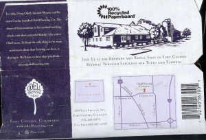
The underside of the carrier has a couple more pages that are readily recognizable: the About Us page on the left, and the Contact Us page on the lower right:
The beer labels are a great example of content branding. So, what can we learn from this example?
- Give each piece of text a focus
- Directly address readers
- Harmonize words and images
Following these three lessons can go a long way to making your website more effective.
Focusing Website Text
If you look at the two snippets of text on the side of the carrier, you can see that they have very distinct foci. The one on the left, beginning with the oversize capital “W” emphasizes the aspects of the brewery they think are most important:
- Family-run
- Beer lovers
- Experimentation
- Dedication to quality
On the other side, the snippet is focused on the beer. The emphasis is on:
- Engaging emotion
- Establishing the style of beer
- Showing the quality of the beer
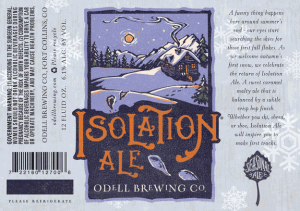
All in a few short words. The text on the bottle label is even more focused on the beer:
Here the emphasis is on:
- Signature emotion
- Tasting notes
- Exhortation to act
All of these pieces of text have their own focus, but they work together to convey the overall brand identity of Isolation Ale: a carefully crafted quality beer with a warming quality that carries with it the quiet solitude of fresh snows.
Directly Addressing Your Reader
On a website, you need to directly address your reader. Always begin with “we” or “you.” Then switch to the other. This creates a bridge to your reader in a condensed way. With only seconds to catch a reader’s attention, you can’t put this off until later in the page. You can’t afford to start by talking about the most current statistics or something else that has no relevance to what your reader wants. Speak to them directly, grab their attention quickly, and don’t let it go.
Look how these labels do that: “We’re a family-run brewery that loves beer.” and “Ever been in a warm cozy cabin and had a secret desire to get snowed in?”
This is a simple lesson, but it’s something that many web writers just don’t understand. Look at many websites out there, and you’ll see they often get lost in statistics, trivia, and anything else when introducing their topic and take too long to directly address their reader.
Harmonizing Words and Images
The logo for Isolation Ale does a fair amount of the work for establishing its brand identity. The image is both unique and shares a stylistic tie with the images used for Odell’s other beers. This is the one that I think works best: the soft, pillowy look of the snow, the deep shadows, the craggy mountains, and, of course, the one set of snowshoe tracks through the otherwise unbroken snow. This image conveys so much that was contained in the text as well.
When you are creating your website, you need to strive as much as possible to create this type of harmony between the words and images. The two should not just be thrown together haphazardly.
Need Strong Branded Content?
If you are looking for a writer who can create a strong brand identity for your website, please contact Writer MC today and tell me about your project.


